
But it works! – the first thing you’ll hear from fans of outdated technology. To argue with them or not – everyone decides for himself, but to understand the essence is worth it. And is modern technology so good? By the end of the article we will have reached a consensus. Today we will talk about the difference between Float and Flexbox. Also, let us consider when they are most appropriate to use and is it possible to mix these properties to position elements?
Let’s get acquainted with many favorite technology of float positioning. A few years ago, this was a really convenient way to quickly put all the elements on the page in their places. At first glance, everything is as simple as possible: the property float: left allows you to press the element to the left edge of the parent, and neighboring blocks will «wrap» it on the right.
It is easy to guess that the specified float property: right allows the opposite result – the element is sent to the right upper edge of the parent. Everything would be fine, but there are a lot of nuances hidden from the eyes of the beginner, which sometimes makes him very nervous, trying to figure out the magic of the fleet.
The first thing to know is that float takes an item out of the document stream. Initially, all elements are lined up one by one from top to bottom. It is necessary to apply float to a certain element as it literally breaks out of a row, the neighboring element immediately takes its place. If we have a float element in the block, this block-parent simply collapses – its height is now zero. Of course, we will have more than one such float element at page layout. Of course, during the time of using float-solutions to these problems accumulated a lot. For example, the clearfix class will help us and will not let the parent of float-elements collapse. Let’s look at the code.
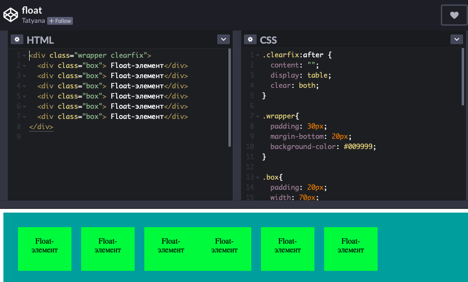
Just finished an extra class and everything! Of course, having a good savvy, you can solve almost any problem. But is it worth it? Float is long, inefficient and not so relevant in the IT world. If you want to make adaptive layout, there will be many more difficulties, after which you definitely want to get to know flexbox.
If you want to build modern sites – then use flexbox. This technology allows you to write 3 lines of code to align elements on the main and transverse axis, allow blocks to stretch, even change the order of their display! And that’s not all.
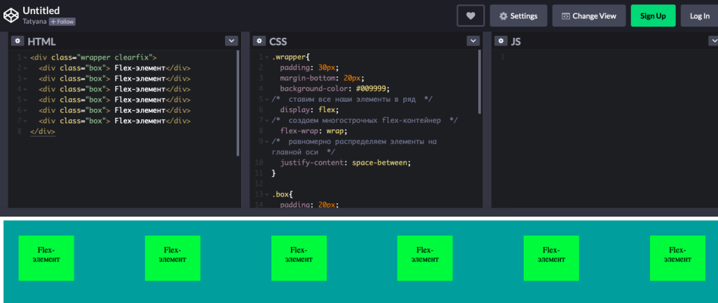
If you want to put blocks in a row, write a display: flex to the parent element. After completing the property justify-content string, we can align the blocks along the axis in a convenient way, including pressing to the right or left edge. In addition, we can place the blocks in the center or place them at a uniform distance from each other. This property alone exceeds by an order of magnitude what float offers us. In addition, the same blocks can be arranged not only on a horizontal axis, but also on a vertical axis using the flex-direction value. The row-reverse value allows you to reverse these blocks.
Should blocks be placed on more than one line? That’s not a problem either. Let’s use flex-wrap property. This is perfect for displaying product cards in the online store, and for portfolio and in many other cases. With a good understanding of all flexbox features, you can feel literally omnipotent. In the example, of course, not all the flex possibilities are considered, but rather the opposite – only the very beginning.
Summarize the pros of flexbox:
flexibility of the units, their ability to stretch and shrink;
simplified vertical and horizontal alignment of elements;
independence from the order of HTML-elements;
the ability to easily adapt to the direction of the text right-to-left.
In order to get to know flexbox and even experiment – we offer to pass free HTML&CSS Pre-URE.